CopyByKD

Creative Strategist — Application

Ten Q4 hooks, three scripts, and a system that stops weak angles reaching your editors.

Built for your giftable kids brand, by KD. Four-minute walkthrough below.

What the test showed

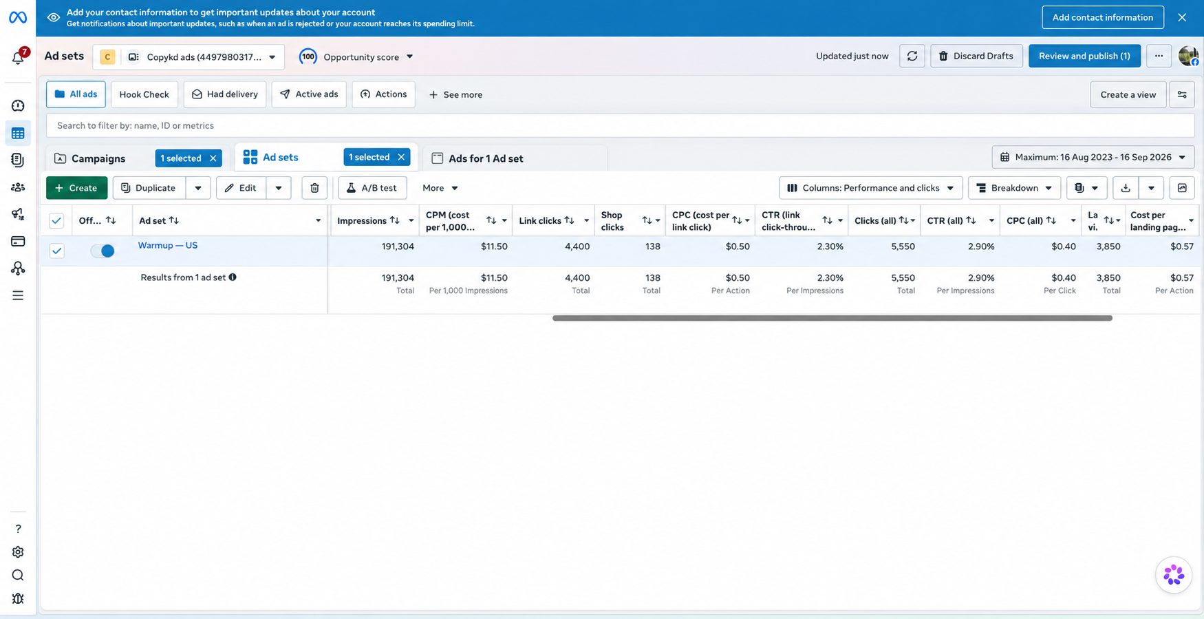
Press to zoom on results Meta Ads Manager ad set results showing 191,304 impressions and a 2.90% overall click-through rate

What won

Three ads, 191,000 impressions, 2.9% click-through at 50 cents a link click on cold traffic. What won wasn't one ad — it was the mechanism behind all three. Each one named a problem the reader already felt, then brought the product in as the answer to that exact problem. Never product first. That's where people buy.

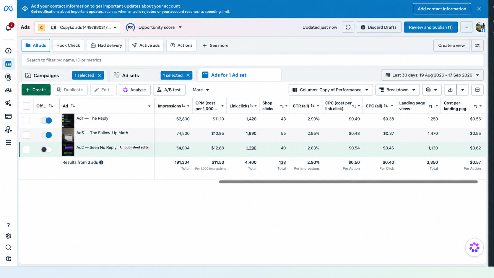
Press to zoom on results Meta Ads Manager ad-level breakdown showing three ads with closely matched click-through rates

What lost

The loser was the test itself. All three landed within 0.12 points of each other, so nothing separated. I'd written the same idea three times instead of three different angles. The fix: the mechanism stays, the angles have to move — different buyer, different emotion, different objection. Two editors producing daily only pays off if what reaches them is far enough apart to learn from. Otherwise it's volume, not data.

Ten hooks

01

The worst kids' gift isn't the one they hate. It's the one they love for five minutes.

Loss aversion

The buyer's real fear isn't a bad reaction on the day — it's wasted money. This names a failure they've already lived through and never put words to. Loss beats gain in gifting because the loss is public: you watch your gift get abandoned.

02

The gift on their wish list might be the wrong one.

Belief challenge

Attacks the one thing every gift buyer treats as safe. A wish list feels like certainty, so cracking it creates an itch that has to be scratched. Only usable if you hand over a replacement immediately — script 2 does.

03

Here's how to stop guessing what to buy for a child.

Benefit first

The plainest hook in the set and the control to test against. If a clever hook can't beat this, the cleverness isn't earning its place.

04

Stop judging kids' gifts by the unboxing.

Contrarian

Goes after the visual language of every competitor ad in Q4. Positions the product against the category's own marketing, so it reads as advice rather than an ad.

05

Nobody tells you what happens the day after the gift is opened.

Open loop

Withholds the payoff so the viewer stays for it. Weakest alone, strongest as a pure scroll-stopper — worth testing whether curiosity carries this niche.

07

There's a parent veto most gift guides never mention.

Parent tension

Same insight as hook 6, aimed at the buyer worried about the parent's reaction rather than the child's. Tests whether the fear or the framing pulls harder.

08

Buying for a child you rarely see? Ask this before you choose.

Relative angle

Speaks only to the aunt, uncle or grandparent — least information, most anxiety about getting it wrong. Targeting built into the hook itself.

09

Forget the product photo. Watch the first ten seconds of real use.

Demonstration

Sets up a direct proof shot. Lives or dies on whether the product demos well, which is why it gets scored only once the footage exists.

10

This is the holiday gift test most shoppers skip.

Q4 urgency

Deadline pressure without a countdown. Frames urgency as diligence rather than scarcity, so it survives longer in the account before burning out.

The three I'd run first

Loss aversion (1)

People move harder to avoid losing than to gain, and in gifting the loss is witnessed. It's the only hook here that makes the buyer recall a specific memory rather than imagine a benefit, and recall converts better than imagination. It hands off cleanly to a demonstration, so the ad has somewhere to go.

Belief challenge (2)

Highest risk, highest ceiling. It cracks the buyer's safest assumption and forces them to watch for the resolution. Hooks like this fail badly when nothing replaces what you took away — script 2 swaps the wish list for a better test, which is what makes it safe to run.

Two audiences (6)

The buyer and the user are different people with different criteria. The child wants the first spark; the parent wants to know what's coming into the house. Most gift ads answer only the child's reaction and leave the parent's objection sitting there, so the buyer stalls at checkout carrying an unresolved fear. Naming both sides removes it.

Three scripts

Script 1 — The five-minute gift

Loss aversion
Visual

Fast unboxing → cut to gifts set aside → uninterrupted clip of the product in real use.

The worst kids' gift isn't the one they hate. It's the one they love for five minutes.

The wrapping comes off. The reaction is great. Then the gift joins the pile.

So I'd ask a different question: what happens after the surprise?

Watch this in real use. That moment tells you more than an unboxing ever could.

End card

See it in action.

Why it's built this way: The hook names the fear, the middle refuses to resolve it in words, and the demo does the resolving. The viewer's own eyes close the argument, which beats any claim you could write. Needs footage that holds up past ten seconds — if it doesn't, the script dies, and that's worth knowing before an editor touches it.

Script 2 — The wish-list trap

Belief challenge
Visual

A scrolling wish list → cut away from polished product imagery → clear demonstration.

The gift on their wish list might be the wrong one.

A wish list shows you what caught their eye. It doesn't show you what happens when the gift is actually in their hands.

So before choosing, skip the perfect product photo. Watch the real use moment. Watch what they do first.

That's the part I'd want to see before putting anything under the tree.

End card

Watch the full demonstration.

Why it's built this way: It removes one certainty and immediately supplies a replacement rule. Without the swap, the hook just makes people anxious and they scroll. The final line steps out of ad voice into advice voice, which lowers resistance right before the CTA.

Script 3 — Two people judge the gift

Dual audience
Visual

Split screen — child's first interaction on one side, the practical detail a parent checks on the other.

Two people judge every kids' gift. Only one unwraps it.

The child wants that first spark. The parent wants to know what comes home with them.

That's why I wouldn't show only the reaction. I'd show the gift being used — and the detail the parent needs to see before saying yes.

If you're buying for someone else's child, you need both sides of the story.

End card

See the gift from both sides.

Why it's built this way: The split screen does structural work — it shows two criteria being met at once instead of describing them. It's also the only script aimed at the relative rather than the parent, which makes it a genuinely different angle rather than another variation. That's the lesson from my own test applied directly.
That's the batch.

Once I've got the product and the footage, every concept gets scored and the weak ones get cut before an editor touches them. Happy to walk through how I'd run Q4 creative with you.